Better !

By David de Leeuw.David de Leeuw

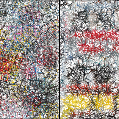
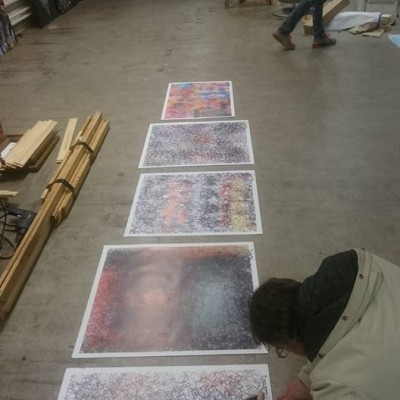
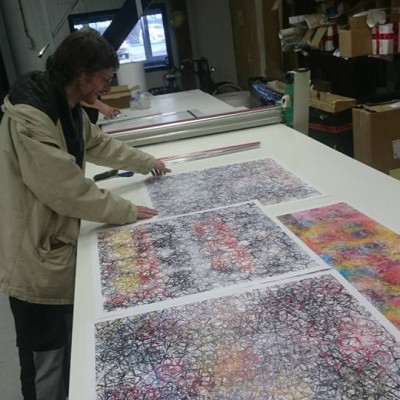
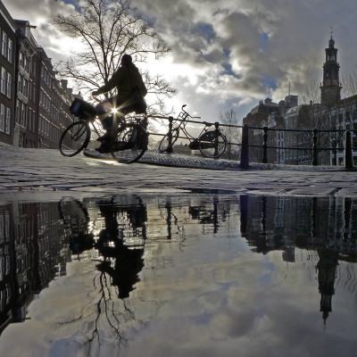
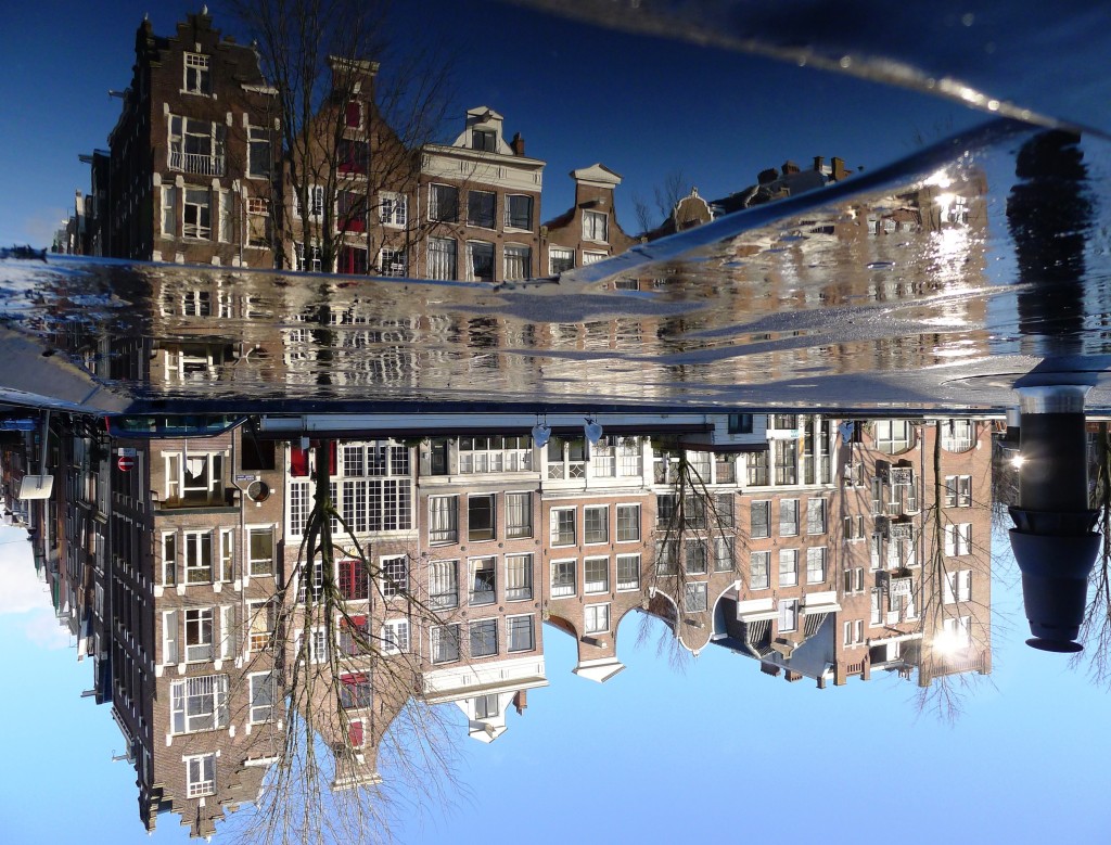
After having photographed for five years, Zart and I decided it was time to move on to the next level. No more JPEG images that show tiny but disturbing little artefacts up close, but RAW photography processed into nice smooth PNG images.And the best printing quality to match, ofcourse.

Why didn’t you think of this sooner?, you may ask. Well, to be honest, it didn’t cross my mind when I started from zilch and developed my photography skills. Still developing those, so Zart clients can look forward to a better and better quality.

Dissatisfaction drove me to look for ways to improve on my earlier work. Granted, there are true gems among those (Zart offers those for sale or rent), but it turned out there were a few pitfalls: over-editing, repeating the same old tricks, to name a few. Also, once I discovered the imperfections of my JPEG images when looked at from a very small distance (or zooming in), my irritiation grew. What were those miniscule rectangle compounds of ugliness doing in my beautiful work?2122

Avoiding those traps now is becoming a second nature of mine. To complicate things, my work as an editor for a national weekly magazine doesn’t leave me as much time to indulge in my photo endeavours as before. Plus, I don’t publish most of my pics because most of my pics are rubbish. Luck is half responsible for my successes.

The other half is perseverance, my growing experience and deep-rooted passion for photography. I believe, as does Zart, that my view of the world through a lens is unique, magical and nowhere to be found elsewhere. Which is not a great accomplishment, by the way. I am just a peculiar person.2612bweb

Looking forward to an improved relationship between us.

May the Zart be with you !

Lucky shot, or is it…?

By David de Leeuw

David de Leeuw‘WOW!’ – I’m sure every photography enthusiast recognizes the feeling when you hit the shutter button on your camera and instantly realize you have a winner here. It happens to me once every 100 shots or so. Not that much, indeed. And while my ‘a day without a good photo is a day not lived’ – motto drives me to pimp and/or fantasize non-existent beauty in my other pics, deep down I KNOW that’s no way to crank up my success rate.

So maybe good things are worth waiting for and I should thank the Lord or the Flying Spaghetti Monster for my luck, or is there a way to trick fate into handing me more WOWs?

David de Leeuw
Fortunately, there is. Luck can be tempted to be on your side. A few tricks I employ to that end:

1 Go out a LOT.

Take your camera with you everywhere you go. That way, when you glimpse something beautiful, it can be captured. Don’t be tempted to let it go, but pause and take the time to take that photo. You never know.

2 Be alert

Pay attention to what happens in the corner of your eye. If something you see gives you that WOW-feeling, even if it’s just like a kind of stir, it’s probably worth your time.

3 Act before you think

Hit the shutter button immediately when something happens quickly but you suspect it might be beautiful. Hey, we have digital photography now! Who cares about a few hundred wasted shots.

4 Get a compact camera

Use a compact camera for maximum reaction speed! Oh wait, that’s just because I lack money to buy one with interchangeable lenses. Skip that.

David de Leeuw5 Gain experience

Gain experience and use it. I now know the temptations of the blue hour, around sunrise or sunset. I especially love it when it becomes the red or pink or golden hour, and when the water of my Amsterdam canals becomes still and reflective. So that’s for timing. I’ve also come to appreciate the shadow and silhouette worlds that backlight can provide: shooting against the sun can produce some wonderful instant mystery. And to that end I like small diaphgrams, a lot.

6 Experiment.

Improve. After too much of the same, I start to bore my audience and myself. Look at pics by famous photographers and be inspired. I try to add more dynamics to my photos. People moving and all that.

7 Leave some room for cropping

Don’t worry about getting it exactly right immediately. Ofcourse tweaking your camera settings is essential, but when not sure about framing the picture, make sure to leave some room for cropping.

And then. Respect luck and accept it whether it decides to lend a hand or to take a nap instead. You’ll see some photos I took posted with this column. They would definitely not have been possible without sheer luck. So thank you, luck. I’ll keep on wandering around to let it find me, and hope it will find you too.

1508e 2

Mash Up

By Moltzer & De Kok

Mash Up is the result of a collaboration between code artist Elout the Kok and fine artist Narouz Moltzer. Zart brought the artists together as an experiment in the Mash Up project.The one-time-duo seems an odd couple at first sight. Whereas De Kok with his (often moving) work focuses on virtual space, Moltzer creates monumental works on canvas. Moltzer, apart from his ever growing presence on social media like instagram, does not have much to do with the digital field. However, what binds the artists is that both criticise society and its rules in their work.

Give a few thousand people a few simple rules, or in this case pixels, and you will immediately get a complete chaos, and funny patterns too, since each individual will apply the rules in his own way.

-Elout de Kok 2015-

Sampling Moltzer’s Big City

Elout the Kok interprets Moltzer’s Big City here. The print is literally a mash up of the original. De Kok sampled a part of the painting. He took various samples of interesting parts and tested a few existing software filters before he came up with the final result. To get the image that best expresses his feeling about Big City, he coded a new filter to get a soft and woolly effect.

New York

Moltzer makes what he calls: reaction art. He responds to what happens in his life and the world. Fans can follow him on instagram where he aims to post a painting a day (@narouzki). Big City is the interpretation of New York as Moltzer has experienced at that time. De Kok, in his turn, started working from the feeling that he had for this work. The monumental painting is full of contrasts: on the one hand reflects the somewhat dark and confined space that crowded city is. At the same time it is cheerful, colourful and one gets the feeling that anything can happen anytime because of the painting’s rich details. It is both static and dynamic.

New rules

In Mash up, De Kok rewrites the rules of the city jungle. De Kok softened the bright colors and turns the boxes of the origial painting into soft edged figures. De Kok translates the reality of the concrete jungle in a new friendlier one, by adjusting the rules; by modifying a sample of the Big City with a filter. Wouldn’t it be great if we could change the world tomorrow, by just writing a new filter?

More about the artists

You can see more examples of De Kok’s work on :http://pixel-lab.org/
or http://elout.home.xsall.nl

Follow Narouz Moltzer on Instagram : @narouzki
or check his website: http://www.narouz.nl

But… but… it’s not REAL !!!


David de Leeuw

David de Leeuw

I often use Photoshop to enhance my photographs. Nothing too spectacular – brighten up some parts of the picture, maybe sharpen a bit or remove some ugly details. This, of course, leads to a number of trolls critics who cry out: FAKE! We’re being CONNED! They insist a photograph must not be manipulated, ever.

Most who voice this opinion are blissfully unaware of the fact that quite a lot of the great photographers of the pre-digital era already manipulated the hell out of their pictures in their dark rooms. Strangely, no-one accuses a Jacob Olie or an Eva Besnyö of forgery. They are, and wisely so, evaded by the perhaps somewhat darkly motivated 21st-century comment crusader who strolls across the internet to expose “frauds” – thereby compensating their own lack of exposure.


Before & After: find the differences


And hey, what about Rembrandt or Van Gogh? Was it REAL what they did? Maybe artists should stick to copy-pasting reality? Or just photographers? God forbid they show us a world of magic that Is Not Real!

Another “It’s Not Real!!!”-cry emerges from folks who insist the puddles I often use to create reflection images are not real altogether. “There is no canal at Nieuwmarkt!” said one commentator after I posted a puddle picture taken at the aforementioned square. Apart from being obviously vision-impaired (a true reflection and a copied reflection are distinguishable) and unaware of perspective effects (a puddle up close often looks like a big lake) I think some people just lack a little faith. Or a life.

David de Leeuw

Artist Page > 


Copying is as Old as the Hills

In Zart’s series Thoughts about Print and Printmaking, we discuss topics based on questions raised by Zartians and Zartists. In our daily life a printmakers, we meet numerous people with ideas and questions. Hence, Zart started to publish a range of articles that will address matters such as copying, authenticity, and status of print in the art scene. Blogger Marceline Geelen gives her view on the matter of copy.

Copying is as Old as the Hills

By Marceline Geelen

Copying of art a dirty word? It’s as old as the hills! The famous Rembrandt van Rijn was so busy drinking, hitting on women and being The Man that he gathered students who could do his job, copying his style meticulously. All he had to do was put his signature at the bottom. Et voilà, a new Rembrandt was born.

What if you live in the mountains, but you love to paint seashores? You go on the Internet and choose a picture or painting – possibly originally made by a well renounced artist and now reproduced by you as if it were the original. Is the painting less beautiful after you copied it?

Good artists, bad artists
In 2014, BBC Culture highlighted an article titled ‘Good artists copy, great artists steal’. Without context, this seems a pretty bold statement, but philosophically speaking, if you dig deeper into the matter, there’s much more than meets the eye. ‘Counterfeiters copy and conceal they are doing so’, is stated in the article. ‘Students copy, as artistic training. Assistants copy, as labor for more famous artists’ (hence Rembrandt, red). ‘But as Sturtevant shows, the border between original and copy, invention and plagiarism, is constantly up for negotiation’.

Authority and authorship
The thin line between art and copy has been a subject of debate for as long as remembered: ‘Sturtevant, who died earlier in 2014 at the age of 89, was faking Warhol and Lichtenstein and Johns – but she was faking the act of faking them too, using the techniques of a parodist  – or criminal forger – for much bolder ends. Philosophically sophisticated but not at all conceptual in execution, Sturtevant’s art actually hinges less on copying than on the big questions of authority, authorship, circulation and history’.

Installation by Elaine Sturtevant

Hyde Park, Serpentine Gallery — “Sex Dolls” (2011), art installation by Elaine Sturtevant. Image: Willard, Source: Flickr Creative Commons

Upper class
If art is only available to look at in a museum, or exclusively affordable for the upper class, what is the sense of it? Why aren’t we all so privileged that we can enjoy our favorite painting every day – above our own couch, in our own living room? Or at least a one-on-one print of it?

We’re positive that none of us will be less impressed by ‘only a print’ of our favorite picture. From experience, we know that we generally lavish our eyes every time again when we look at it, over and over discovering new aspects and details. Details we would never have figured out by just watching the piece of art for a few minutes in a museum or gallery before we head over to the next one. Just sayin’.


Likes, egos and freedom

By David de Leeuw
David de LeeuwI share I lot of my photography on facebook as well as elsewhere on the internet. Aside from (if I’m lucky) ego-boosting numbers of likes, comments are made and often a dialogue with the audience ensues. A ritualistic exercise in futility, I find.
Some examples:

1. ‘Mind the rule of thirds!’

A favourite among some of my followers. The rule of thirds means that the object of your photo should be at an intersection located somewhere else than smack in the middle. That would be more pleasing to the eye. Well, I disagree, even if the principle were true in general. I like a lot of my work, especially reflections, with a horizon SMACK in the middle. I work intuitively, learn as I go and make up my own rules. Reinventing the wheel perhaps, but definitely evolving my way instead of fearfully studying all possible rules and techniques, or maybe attending a boring, ‘let’s drain those sheep of all their money’- kind of photography school, before finally venturing out. Does this make my photographs less pleasing to the eye? A growing number of buyers don’t seem to think so. And neither, of course, do I.

Cyclist, David de Leeuw Amsterdam 2015

2. ‘Make it a square!’

I truly have no idea why people so vehemently propagate square photos. I like all sorts of formats. Broad often makes a dramatic impression, long vertical photographs can both minimise and, therefore, accentuate some tiny detail(s) at the bottom edge. And, most importantly, I DO rather than THINK. My photographs come into existence without much thought, but with just the eye, intuition and experience. That is the ‘story’ and ‘philosophy’ behind my work.

3. ‘You always photograph reflections in water!’

Yes! 🙂 I bloody well photograph what I like. That’s what’s being an artist is about. If you don’t like it, don’t try and make me do something you DO like – go look for artists who cater to your needs. I do what I want and the popularity of my work is a pleasant consequence to me, not a driving factor. I am not an art takeaway – what were you thinking?

Now, this is not to say that I am a very accomplished photographer. Remember, I just started three years ago. I can safely say, however, that a lot of comments originate from people who –when I take a look at their photos- almost never succeed in bringing magic into their work. One can sense they are stifled by convention and obsessed with technique and equipment. ‘I have just bought a so-and-so camera with a this-and-that lense!’ they clamour, and still the results remain the same – bleak and boring, boring and bleak.

My equipment has been, and will be for some time, a modest compact camera – the Panasonic Lumix DMC LX5 and LX7. Suits me just fine and it’s all I need. I can carry it around and use it everywhere. Heck, I’ve seen people make fantastic shots with their mobile phones. Equipment is second to artistry. So, all you would-be critics: surpass me by your works, not words!

Two cities

Artist Page>


3 Common Misunderstandings About Print

As printmakers, we Zartists have to deal with a lot of old-school presumptions about the art of printmaking. The three most prevailing misconceptions regard its status as a ‘copy’, the notion ‘authenticity’ and its ‘value’. Hello art world! It is time to dust of ideas from before the turn of the century and start to rethink the status of print and printmaking. We will raise a few questions here rather than we can provide full answers. The three big But(t)s we often deal with are:

1.”But it ‘s a copy!”

False: it is a remake

To speak of copying is so last century. Copying is dead. Copying is something you do online when you grab a picture someone posted and add a comment to look smart. We prefer to speak of remakes. Why do we refuse to speak of copies? To start with, it is truly an art to make a good print. It is not exactly the case that you can put a painting under a photocopier and expect a good print. Of course a print is a remake of a work and concept that already existed, that can’t be denied. Zart recycles a concept of an existing work and transforms it into a new ‘product’. But you can hardly call it an exact copy. In the words of Zart photographer Bram Kloos: “ Making a print is an art in itself. It is quite difficult to make a photograph of a work and translate it into an exact same image. I do not see why anyone would think of a print as a lesser product. It is a different product. Of course, you are highly indebted to the creator of the original idea when you use a work as a basis, but the prints appear in a completely different form. The material is very different. I fail to see why that is something bad”. Zart couldn’t agree more.

2015 Zart 3 misunderstandings about print infographic

2.”But it has to be authentic!”

A Print is not the same as forgery

In art, buyers want a work to be authentic because being real defines the price and cultural value a work. Authenticity is not one thing. Most of the time people refer to the origin of authorship, though. Who made the work and how do you know it is not a forgery? Printmaking is often associated with forgery. Zart makes its prints in co-authorship with the artist who created a concept, an installation, a virtual work a graphic or a painting. Since we work with living artists we have the opportunity to request a certificate of authenticity. The certificate carries the original signature of the maker.  That way there can never be any misunderstandings about the origin of the works. The works appear in limited editions only. The prints are signed and numbered. What is not real about that? Let’s not confuse a print with a forgery please!

3.”But a print has no value …”

Time will tell

As no one can tell for sure which artist will be of ‘worth’ – money wise, buying art as an investment for your great grandchildren is not a good reason to purchase anything. As art pope Charles Saatchi states in an interview to a journalist of the Guardian when asked what artists will write history: “ General art books dated 2105 will be as brutal about editing the late 20th century as they are about almost all other centuries. Every artist other than Jackson Pollock, Andy Warhol, Donald Judd and Damien Hirst will be a footnote.” So if you are interested in art, you might as well choose a work that suits your taste and wallet. From this perspective, there is a lot to say for a print. Only time will tell who will be classic. In the meantime, Zart thinks it is best to let Zartians decide for themselves what artist is hot or not.

Call for entries

Bloggers pay attention

A million more things can be said about print and copying, value and authenticity. Do you agree? Do you think our line of argumentation is off the wall?? Are you a blogger or a writer who has something to say about print & printmaking on a slightly theoretical level? Do not hesitate to offer us your contribution! Send us your article. We will be happy to take your work into consideration for publication on our blog. Articles can be sent to info@zart.nu .

Why Do We Multiply?

Everyone knows what a Platypus looks like, can envision the rings of Saturn, imagine a blue whale, ‘knows’ how lava flows, or even search for an X-ray scan of a Masai warrior’s chest. From the cradle to the grave we are bombed with visual input. With each image that rushes into our world our concept of the world grows. There is practically nothing we did not see before. Nothing we can not imagine. What can be known is shared. Even in real time. We obviously have a desire to pass on what we see and hear, a need for news, a passion to multiply.

Life is Sharing by A. Levine. shared by cogdogblog

Life is Sharing by A. Levine. Source: Flickr Creative Commons Licenced (BY-SA)

Sharing culture

It looks like the image has gained power over the written word with the rise of the internet. Where we used to read articles we now prefer an info graph. A good press picture is as powerful as a journalistic report. Why do we prefer images over text these days? One explanation is that an image is easier to share. It is more practical as a way of communicating with the world. When we see or hear something new we want to share this fact with our friends or who ever wants to listen. Visual information simply takes less processing time and is easily absorbed in the midst of the information overload. It is easier to digest. Thanks to modern distribution techniques sharing never was easier. An image can be multiplied by pressing a button.

Power to the image

The steady growth of the power of the image did not happen overnight. Visual culture experienced several revolutions. There seems to be a relation between the desire for news and the art of printing. More specific, we are referring to the art of multiplying. People set out by manually copying on a small-industrial scale. Then there was the invention of printmaking like engraving woodcuts, lithography, followed by working with rotary presses, photography, film and motion picture, television, the digital image, and finally the ubiquitous ability to create images and immediately share them with the whole world through the internet. Apart form all kind of psychological aspects, one of the main reasons we share our images with the world because we can. Because we have the techniques.

mage from page 14 of "A short history of the printing press and of the improvements in printing machinery from the time of Gutenberg up to the present day"

image from page 14 of “A short history of the printing press and of the improvements in printing machinery from the time of Gutenberg up to the present day”. Source: Flickr creative commons

News

In the past, let’s say in the Middle Ages, images were rare. A man knew the faces of his fellow villagers, the local landscape with its buildings and animals in it. The only variation on the images of the familiar surroundings formed the predictable change of the seasons. Maybe he saw a stained glass window in the local church, a painting or fresco, a pair of saints or a tapestry. New visual input was rare. News in general was an extraordinary thing. News usually came in the form of spoken word, storytelling, songs and gossip. Nowadays we consider visuals also as news.  Visually, news could be a new face to watch, perhaps a strange pair of trousers or unknown keel or cap to stare at, and stories from behind the horizon to listen to.

Hunger for news

One can imagine that the hunger for visual input due to lack of outside impulses led to intense studies of things and creatures that were available in the direct surroundings. The average person in the Middle Ages may have known in detail all trees, plants, animals and people in his habitat. Botanists and travellers drew in detail what they saw. Most imagery was religious or scientific by origin. It did not take long before popular images were reproduced by copyists in monasteries and studios. By hand. This changed radically with the invention of the printing press in the 14th century. Pamphlets, prints and illustrated books spread over Europe. With the books and illustrations a world of ideas also spread. Like in today’s FB updates, people wanted to share their view on the world.

So we share our images with the world because we have the technique. Thanks to modern distribution techniques sharing never was easier. The techniques are constantly renewed but the need to share news and things that surprise us or emotionally hit us, remains the same. Did anything really change?  


Joep Zijp

Joep Zijp

Every now and then Zart invites a guest writer to say something about art, printmaking, graphic design or photography. This week we are highly indebted by by Joep Zijp for his contribution. Joep whas journalist and editor  for several media and worked for publishing house Sanoma among others.

The Artist in Residence

2015 narouz moltzer, Interpretations of Van Gogh

From the first week of June 2015 onwards Zartist Narouz Moltzer is artist in residence at the Van Gogh House in Zundert where he will work on a series of portraits of Vincent van Gogh. Zundert is the birth place of Vincent van Gogh – there he spent the first years of his life. Moltzer is best known as a painter and for his abstract portraits. By way of experiment, he painted a few portraits of Vincent van Gogh and got selected for the Artist in Residency project. 1+1=2, You see.

2015 narouz moltzer, Interpretations of Van Gogh

2015 narouz moltzer, Interpretations of Van Gogh

125 Portraits of Vincent van Gogh

During his stay on holy ground, Moltzer will try to finish a series of 125 portraits of Van Gogh during his four week-residency. At least that is the plan. Spokesman of the Van Gogh House, Ron Dirven, says he selected Moltzer for the following reason: “Narouz had been working on a few portraits of Vincent van Gogh already. The Van Gogh House wanted to give him the opportunity to expand on his works and make a series”. Zart thinks that is lovely.

In the spirit of Van Gogh

Narouz will be staying in the atelier with accommodation on the top floor. The restored verger’s house from Van Gogh’s period is just a stone’s throw from the Vincent van Gogh House. A gallery has been established in this annexe. Next to this is a new guest studio housing a Van Gogh ‘Artist in Residence’. Artists from home and abroad are invited to work here for a period of time in Van Gogh’s genre. “The goal of the artist in residency programme is to inspire contemporary artists who come to stay to make something in the spirit of Van Gogh. The purpose is to motivate the to artist in residence to create something different than they do at home”, Dirven says informing us on the project.

It’s not easy to be an ‘Artist in Resident’

What does it feel like to work on the very grounds where the great master Vincent van Gogh was born? Zart briefly spoke with Narouz to hear how he’s doing in Zundert. Moltzer says he has done a lot of work, the people are super friendly but he starts to miss home. He has done 50 to 55 works now, thats seems to be on schedule with two weeks left. In contrast to what you would expect, it does not feel like being on holy ground to Moltzer. This partly has to do with the modernisations of the guest house and partly with the new experience of being Artist in Residence.

uest Studio Van Gogh House http://www.vangoghhuis.com

Guest Studio Van Gogh House http://www.vangoghhuis.com

Home is where the heart is

When asked whether he rather works as an artist in residence or at home Moltzer frankly answers: “ Home!!! Unless I could be alone all of the time. And if I knew it was like this, i would have organised things better at home so I wouldn’t have to worry about anything. I would have brought more stuff for example. Now I had to travel up and down a few times. It’s the first time I experience an Artist in Residency like this”, Moltzer continues.

Mixed feelings but very special

Moltzer was greatly honoured to be invited for the project the last time Zart saw him. Is it what he expected? “ It is a bit different than I thought”, he says. “It is a wonderful experience though. I have been looking forward to it. When I wake up and open my window, I look out over the yard that harbors the grave of Vincent’s’ brother, who died in childhood. And I live next to church where his dad used to preach. That makes it all very special to be here.” Moltzer is not sure (yet) how this Artist in Residency project has influenced him. He is only halfway after all.“ I don’t think I changed the way I work”, he tells us. “On the other hand, probably because the atelier is so light and the beautiful surroundings, I have refreshed my colours”.

What the H*** is this?

The Artist in Residency and the Van Gogh House itself draw many visitors. Moltzer indicates that is the most difficult part for him. It is great to have an exhibition but less great to BE the exhibition, so he experienced. “All day long there are these groups of people passing by”, Moltzer tells.“Behind those glass windows, I feel like a fish in a bowl. I am there right in front of their camera’s. I wonder all time : “what the H** is this? Can you imagine? That is a thing I can’t get over somehow”.

2015 narouz moltzer, Interpretations of Van Gogh

2015 narouz moltzer, Interpretations of Van Gogh

Future exhibition and symposium

As all of you, Zart can’t wait to see the results of this project. The Van Gogh House plans a symposium and an exhibition of all works made during the cycle of Artist in residency projects. The dates are not fixed yet but you can follow news about events on their website: http://www.vangoghhuis.com

On Saturday, the 26th of June, the Van Gogh house will present Moltzer’s work as a sneak preview.
Artist page >

How to make an abstract selfie

Are you ready to reinvent yourself? Rembrandt did it, Van Gogh did it and so can you! We have an irresistible solution. Instead of going around with a selfie stick to get the best angle for your profile picture. Instead of going to the hairdresser or making radical life choices like gambling away your house or cutting off an ear, you could try Clippr. Clippr is an online image distorter developed by Elout the Kok, owner of Pixel Lab. It is fun to try and gives you an abstract portrait for free. Get your own artistic selfie at Clippr. You can’t change the world, but you can change yourself.

Unfortunately, the mobile version of Clippr has some difficulties. You can see how the tool works, though. To create your own work you will have to get to you desktop or laptop to run it. Sorry, we are working on that! We hope you will enjoy it anyway.

CLIPPR>

Metamorphosis: Van Gogh and Rembrandt meet Clippr

Tutorial on Clippr

Not sure how it works? Read the tutorial.


To Artist Page>

The Accidental Artist

Incidentally, Zart invites artists to write a guest post. When asked to do something for Zart on art and photography, David de Leeuw is for once at a loss for words. This does not happen very often. David is a senior editor and journalist in the first place. He did not take his work as a photographer very seriously at first. Until the success of his recent photo series Reflections blew everyone, the artist included, away. As so many others before him, he is an accidental artist really. Read his story.

The Accidental ArtistDavid de Leeuw

By David de Leeuw

Writing a blog post? About art and photography? I really have no clue. Alright, I take pictures and Zart sells them and rents them out. That transforms my pastime into art all of a sudden. Not that you will hear me complain. Let’s proceed to tell you how I go about the business of making photos, shall I? And why I do it in the first place.

From Keyboard Mercenary to Photographer

It wasn’t until 2012 that I bought a camera, a Panasonic Lumix DMC-LX5 (compact) and started photographing for real. I was 47 then. Before that, I’d never taken pictures. I thought it was bollocks, really. ‘You can always remember where you’ve been, right?’, I thought. That turned out to be not quite the whole story 🙂 As a child, I already had a sense for moods and atmospheres, not only with people but also with environments like cities. I didn’t know what to do with that inner world of magic and fantasy. At 25, I’d already turned my writing talent into word prostitution. After a working day as a keyboard mercenary, I’m completely empty. Who knew a camera could come in handy as an instrument to express myself? I discovered that in 2011, when I started taking simple snapshots. That was fun! Likes on facebook! Hi, I’m David and I’m a facebook-likes-addict. People encouraged me to proceed and I switched to a real camera.

Mirror City

Mirror City

Reflections

I’m steadily wising up as a photographer because I ‘have to’ venture out with my camera almost every day. EXPRESS YOURSELF! the expression animal keeps on urging me. So then I take a walk and see what happens. I love puddles. When I hold my camera just above it or even dip it in, lovely reflection photographs result. Why doesn’t everyone do it this way! Tourists and locals crowd the streets and look wearily upon the kneeling fatso taking pictures of water in the gutter. They don’t know, do they. Of course, reflection photos become a bit of a standard trick after a while but I LOVE IT! A recent discovery is the vertical panoramic picture, a great way to cut out a beautiful and relatively unspoilt image in ridiculously busy city centres with ugly cars and clothes everywhere. For the past half year or so, I’ve been using a photo editing programme which shows me all the colours in black and white and how to correct warped perspective so buildings appear straight again. Sharpening is a nice tool and highlights and what have you but you must be careful not to exaggerate, however, that can be good too at times and blah blah blah, look I’m already rambling.

Photography  as a Free Zone

Bike Star

Bike Star

In principle, everything I do is intuitive and through experience, a bit of craftsmanship creeps in. I don’t read manuals, it all comes naturally and that’s the way I’d like to keep it. I don’t do assignments, photography is my free zone. Of course, I have Great Examples, from Eva Besnyö and Jacob Olie to Pim Kops, a contemporary fellow Amsterdammer. All of them real artists. Am I one, or becoming one? Judge for yourself on Zart.

Artist page >

Pochemuchka design: collage art as integrated design

All things change and we change with them. This is the leading idea behind the collages for Zart by Esther Vreeland, aka Pochemuchka Design. Pochemuchka Design is best known for her collage art. Vreeland is not too fond of the label ‘artist’ but would rather be seen as a designer. Together with Zart she also started to produce what could be called integrated design concepts. Integrated design is a term borrowed from architecture referring to a collaborative designing method that requires multidisciplinary teamwork. From beginning to the end, all stakeholders are involved in the design process. Vreeland is a master in remixing all kind of elements into one total design. The product, formerly know as artwork, can be a large visual or a room. In the end, it is the juxtaposition of smaller design elements that tell a story, make up a collage.2014 zart esther vreeland

Catchy Sketchy Style
Is there a Pochemuchka style? ”I do not have one way of working”, Vreeland says,”although I do have to admit that I often use simple cut and paste techniques. I take cut outs from drawings. Somehow that feels a bit mysterious because you do not know in advance what story will come out in the end. What remains to see after the cut out process is just one isolated part of the original image. If you assemble all pieces into one new work, it resembles a sketch. Vreeland reaches a sketchy effect or ‘look and feel’ if you want, by adding (hand) drawn elements to the collage”.

Visual dj-ing
Vreeland’s collages work might best be seen as a remix of little stories. Like a DJ mixes records into new tunes, Vreeland mixes visuals. She singles out a story line, cuts it up and remixes it into a new form, a new scene. Being born and raised in Amsterdam Vreeland saw some big transformations. The process of change is one of growth and decay, of construction and deconstruction. Vreeland:”I was born in the Runstraat. One of the Nine Streets and have seen the city transform. When I used to live there, it was a working-class street. There were a grocery and a druggist and we had the milkman downstairs. Many people still used coals. Now the Runstraat is one of the Nine Streets. The grocery is is some posh beauty parlor. Everything has changed, of course. If you look at our constant changing world as a story, it becomes a tale of continuously constructing and deconstructing all kind of things. Many things happen all the time and these events leave their traces.”
elevation montage 1 imgur_Collage
Vreeland picks up traces everywhere. Elevation Montage is full of such traces. “Sometimes I peek through a window and I wonder what is happening inside” Vreeland starts to explain the origins of this work. “And so many things happen. Behind every door and window a story unfolds. There is a scene everywhere. A city is a place of coming and going of people. It has a history of many things happening. Now and in the past. I used to live I a house where someone hanged himself. One of my friends was scared to come and see me there because of what happened. I felt that was nonsense because good and bad things have happened everywhere all the time, for centuries”.

DIY adventures
“Every window tells a story. I wanted to breathe life into all the little houses, so there would be a small face everywhere”, Vreeland continues. Since one can’t go around and take pictures of people in their homes, Vreeland just looks for pictures on the internet that somehow grab her attention. “Like this man’s letter” she says while she points at the small image in the top left corner of Elevation montage. “Who is that man? You can look at it and make up a story. This gives me a feeling of adventure and traveling without GPS. As if anything can happen. If you would place all the small images in another context, you will get a completely different story ”.

A Panorama for the Zuiderbad
To Vreeland collage is the art of remixing daily life. Because there is so much choice –take a look out of the window- it is difficult to limit oneself. It is not a secret Vreeland prefers to make commissioned work.“I like a clear starting point”, she tells. In the image below is a work specially made for the Zuiderbad, the swimming pool situated next to the Museumplein. In it you can see how images and important places like the Rijksmuseum and the fire brigade, images from the past and present relevant context collide into an enormous panorama of 60x 1.80.
Zuiderbad Original kleineri]
Red bricks and tourists
“The only guiding principle for creating this panorama, was the client’s idea about what should be in the image. The Zuiderbad wanted a large visual of the front of the building. So that is where I started. In front of the building”. Vreeland worked together with illustrator Steve Dumayne. “I usually work with preliminary study. Steve had the idea to go to the Museum square and to take pictures of things that happen on the square and the general surrounding”, Vreeland says about the working process. “
referentie - kopie
The Zuiderbad lies in one of the most touristic areas of Amsterdam so we had to get some tourist in, that was inevitable. But the old gangster car happened to be there as well”. When Vreeland and Dumayne started with their mood board, the first thing that jumped to the eye was the colour red. “If you sit down in the area you will see that all buildings are built with the same type of red stones”, Vreeland continues. On the corner is the fire brigade with its red cars as well. The red bricks form the unifying factor in the panorama”. Historical context “In our first draft”, Vreeland says, “we added some traces of history and superheroes to stress the importance of the surrounding buildings. The building on the right used to be the Velox cycling school. This is where people used to learn how to cycle. Now it is called the Veiligheidsgebouw, the House for Safety and Security”. In our first sketch, I put superheroes behind the windows to reach a sort of vigilante effect. This idea was rejected, unfortunately. So I replaced the superheroes for figures from Rembrandt’s Nachtwacht and this way kept the spirit of the Veiligheidsgebouw and at the same time linked it to the Rijksmuseum.”

Book us
You can book us for redesigning your place, hotel, lobby reception or a custom made large visual
through the contact form. See work by Pochemuchka design https://www.zart.nu/portfolio/esther-vreeland/

Schermafbeelding 2014-11-06 om 12_Fotor_Collage

Great Art on a Small Format

kunstverhuur, canvas, plexi, acylic glass, frame,

New at Zart: High-quality prints on canvas or acrylic glass (Plexi) in smaller sizes. Where everyone else wants to go bigger, Zart takes the super-size trend into another direction. Zart goes from Large to Medium. This way we hope to make our collection even more accessible. Art should be for everyone and Zart makes it possible. A smaller size means a better price!

From print to frame

Comparing a print on canvas to a print on Dibond is hardly fair. The end results are radically different. What remains the same is the super high quality of the print. As you can see on the collage below, we take great care of all details from the beginning till the end. At Zart, we do not publish large editions. Our collection demands great craftsmanship from various parties, the artist, our printer and our framing fabric. Therefore, we are extra proud to be able to give you our special canvas – and Plexi deal.

kunsteverhuur, canvas, plexi, acylic glass, frame,

A step-by-step overview of how your canvas gets framed.

Canvas deal

All works on canvas are printed in a limited edition of 30 pieces. You print is delivered signed and numbered bordered with a frame. The price of a canvas print is €425,-. Those who want to rent a print pay €25,- a month for the minimal period of 6 months.

Canvas Print

Period

Limited edition

30 pieces

Format

70×70 cm

Buy it

€ 425,00

Forever yours!

Rent A

€ 25 a month

6 months

Rent B

€ 20 a month

12 months

Frame

yes

Plexi deal

All prints on plexiglass are printed in a limited edition of 60 pieces. Works come signed and numbered with a suspension system. The buying price for a work on acrylic is €195,-. In case you want to rent it for half a year, the price will be € 15,- a month. Those who rent if for a year can do so for just €10,- a month!

Acrylic Glass (plexi)

Period

Limited edition

60 pieces

Format

60×60 cm

Buy it

€ 195,00

Forever yours!

Rent A

€ 15,00 a month

6 months

Rent B

€ 10,00 a month

12 months

Suspension system

yes


For more information on the availability of individual works, see our Artist section or call Zart.
T.  020 337 77 39 
/ M: 06 49 37 02 54


Enjoy the Zart experience

4 good reasons to make an appointment !

Don’t go anywhere! Zart will come to you. All you have to do is to check your agenda and make an appointment. One of our employees will come to your home or office to give you a private peek in our collection. What is better then having a small exhibition in the comfort of your own place? Here are a few good reasons to get the Zart experience:

1. “It looked different on the web…”

Yes we know. You can never get the feel for a work of art if you do not see it real time. In the place you had in mind for it. In the evironment where it will hopefully stay for a long time. By showing you several works that migth be of interest to you. We hope to make you “experience” the work. You will be able to feel it and see where it fits best. This is a great way to see if the piece you liked at first sight is really what you had in mind.

2. Zart’s prints are valuable

Our dibond-prints are produced with the greatest care. We made it our objective to keep art available to many by pricing the work as such. However, it is not a poster you buy/rent or lease. It’s a work of art. The pieces need proper care and in this way we can give you all the information you need to keep it in the most perfect condition.

3. Sharp prices

Rent, lease or buy? Once you have chosen one or more works, Zart will make you a financial proposal. When you like to rent a couple of pieces for a longer period of time an have not decided yet what to do -rent or lease?- You may want to negotiate the pricing model. This is easier when you talk face to face. Remember, we try to make purchasing art as easy as possible. Completely painless!

4. Special offer

Next month we will start a massive discount action. Make an appointment now and make sure to have the first choice. After all, the works are produced in a limited edition. Sold out is sold out.

Renting art is painless

Renting art is painless.

5 Good reasons to rent an artwork

The main reason why people buy art is simply because it makes one feel good. Renting art can make you feel even better. Buying art could be compared to buying clothes. It involves a risk. You just bought that great suit. When you get home, you discover that there is no matching shirt, the sleeves are too short and doubt settles in. Was your purchase worth the money? Unfortunately the receipt disappeared mysteriously. Taking the suit back to the store is no longer an option. As a result you feel uncertain, frustrated or even angry. If you buy art, you might end up feeling the same way. In that case, why do you not consider to rent an artwork? Renting art is absolutely painless.
5 good reasons to rent instead of purchase a work:

1. Impulse Buying is history

We all know that feeling: in the spur of the moment you take that unplanned decision to buy something. Once you purchased the piece, there is no way back and you start to doubt your decision. When you decide to rent a painting, there is no such pain. At Zart we help you to make the right decision without a financial risk.

2. A fixed price

How do you know the work you bought is not overpriced? How can you decide upon its value? The truth is that you can never be sure the price its worth the value. As a result you will probably override your budget. Renting a work avoids the question of price and value all together. When you rent a piece at Zart you get it for a fixed price, namely: €25,- a month.

3. A reliable partner and good advice

Most art lovers who want to buy a work, do a lot of research first. What they find is a lot of different information about a piece of art coming from a lot of shady sources. This creates insecurity. How do you know a work is real? How do you know it has not been stolen? In Zart you will find a reliable partner. When you rent from Zart, you know what you get, where the work comes from, and how many prints have been made.

4. Taste

Collecting art is a matter of taste. We don’t doubt your good taste, but your partner, colleagues or flatmates may do. Renting art is painless with respect to making choices: you can’t go wrong. If others object to the work of your choice, Zart offers the possibility to take back the work.

5. Instant make-over

Sometimes a space just needs a new look. Or you may be relocating and the new building has a totally different atmosphere then the old one. The old works just do not add anything to the new space. In that case renting a few works is attractive. It is an affordable way to quickly give any place an instant contemporary look and feel after your personal taste. See our latest collection of prints at www.zart.nu