Likes, egos and freedom

By David de Leeuw
David de LeeuwI share I lot of my photography on facebook as well as elsewhere on the internet. Aside from (if I’m lucky) ego-boosting numbers of likes, comments are made and often a dialogue with the audience ensues. A ritualistic exercise in futility, I find.
Some examples:

1. ‘Mind the rule of thirds!’

A favourite among some of my followers. The rule of thirds means that the object of your photo should be at an intersection located somewhere else than smack in the middle. That would be more pleasing to the eye. Well, I disagree, even if the principle were true in general. I like a lot of my work, especially reflections, with a horizon SMACK in the middle. I work intuitively, learn as I go and make up my own rules. Reinventing the wheel perhaps, but definitely evolving my way instead of fearfully studying all possible rules and techniques, or maybe attending a boring, ‘let’s drain those sheep of all their money’- kind of photography school, before finally venturing out. Does this make my photographs less pleasing to the eye? A growing number of buyers don’t seem to think so. And neither, of course, do I.

Cyclist, David de Leeuw Amsterdam 2015

2. ‘Make it a square!’

I truly have no idea why people so vehemently propagate square photos. I like all sorts of formats. Broad often makes a dramatic impression, long vertical photographs can both minimise and, therefore, accentuate some tiny detail(s) at the bottom edge. And, most importantly, I DO rather than THINK. My photographs come into existence without much thought, but with just the eye, intuition and experience. That is the ‘story’ and ‘philosophy’ behind my work.

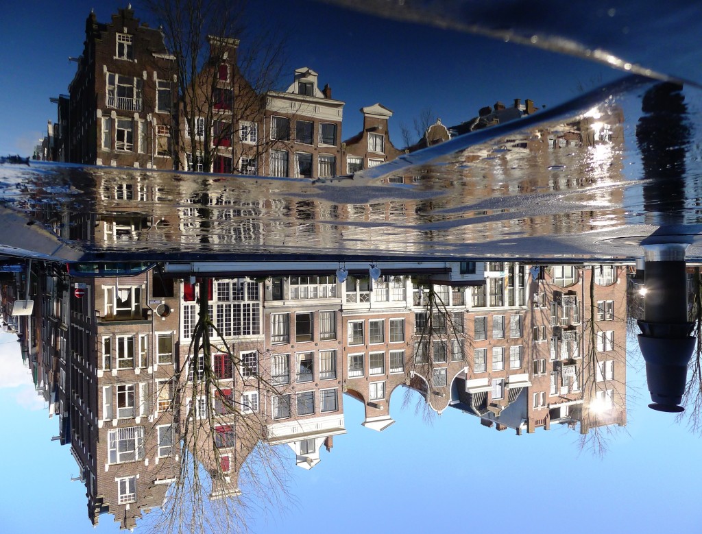
3. ‘You always photograph reflections in water!’

Yes! 🙂 I bloody well photograph what I like. That’s what’s being an artist is about. If you don’t like it, don’t try and make me do something you DO like – go look for artists who cater to your needs. I do what I want and the popularity of my work is a pleasant consequence to me, not a driving factor. I am not an art takeaway – what were you thinking?

Now, this is not to say that I am a very accomplished photographer. Remember, I just started three years ago. I can safely say, however, that a lot of comments originate from people who –when I take a look at their photos- almost never succeed in bringing magic into their work. One can sense they are stifled by convention and obsessed with technique and equipment. ‘I have just bought a so-and-so camera with a this-and-that lense!’ they clamour, and still the results remain the same – bleak and boring, boring and bleak.

My equipment has been, and will be for some time, a modest compact camera – the Panasonic Lumix DMC LX5 and LX7. Suits me just fine and it’s all I need. I can carry it around and use it everywhere. Heck, I’ve seen people make fantastic shots with their mobile phones. Equipment is second to artistry. So, all you would-be critics: surpass me by your works, not words!

Two cities

Artist Page>


Pochemuchka design: collage art as integrated design

All things change and we change with them. This is the leading idea behind the collages for Zart by Esther Vreeland, aka Pochemuchka Design. Pochemuchka Design is best known for her collage art. Vreeland is not too fond of the label ‘artist’ but would rather be seen as a designer. Together with Zart she also started to produce what could be called integrated design concepts. Integrated design is a term borrowed from architecture referring to a collaborative designing method that requires multidisciplinary teamwork. From beginning to the end, all stakeholders are involved in the design process. Vreeland is a master in remixing all kind of elements into one total design. The product, formerly know as artwork, can be a large visual or a room. In the end, it is the juxtaposition of smaller design elements that tell a story, make up a collage.2014 zart esther vreeland

Catchy Sketchy Style
Is there a Pochemuchka style? ”I do not have one way of working”, Vreeland says,”although I do have to admit that I often use simple cut and paste techniques. I take cut outs from drawings. Somehow that feels a bit mysterious because you do not know in advance what story will come out in the end. What remains to see after the cut out process is just one isolated part of the original image. If you assemble all pieces into one new work, it resembles a sketch. Vreeland reaches a sketchy effect or ‘look and feel’ if you want, by adding (hand) drawn elements to the collage”.

Visual dj-ing
Vreeland’s collages work might best be seen as a remix of little stories. Like a DJ mixes records into new tunes, Vreeland mixes visuals. She singles out a story line, cuts it up and remixes it into a new form, a new scene. Being born and raised in Amsterdam Vreeland saw some big transformations. The process of change is one of growth and decay, of construction and deconstruction. Vreeland:”I was born in the Runstraat. One of the Nine Streets and have seen the city transform. When I used to live there, it was a working-class street. There were a grocery and a druggist and we had the milkman downstairs. Many people still used coals. Now the Runstraat is one of the Nine Streets. The grocery is is some posh beauty parlor. Everything has changed, of course. If you look at our constant changing world as a story, it becomes a tale of continuously constructing and deconstructing all kind of things. Many things happen all the time and these events leave their traces.”
elevation montage 1 imgur_Collage
Vreeland picks up traces everywhere. Elevation Montage is full of such traces. “Sometimes I peek through a window and I wonder what is happening inside” Vreeland starts to explain the origins of this work. “And so many things happen. Behind every door and window a story unfolds. There is a scene everywhere. A city is a place of coming and going of people. It has a history of many things happening. Now and in the past. I used to live I a house where someone hanged himself. One of my friends was scared to come and see me there because of what happened. I felt that was nonsense because good and bad things have happened everywhere all the time, for centuries”.

DIY adventures
“Every window tells a story. I wanted to breathe life into all the little houses, so there would be a small face everywhere”, Vreeland continues. Since one can’t go around and take pictures of people in their homes, Vreeland just looks for pictures on the internet that somehow grab her attention. “Like this man’s letter” she says while she points at the small image in the top left corner of Elevation montage. “Who is that man? You can look at it and make up a story. This gives me a feeling of adventure and traveling without GPS. As if anything can happen. If you would place all the small images in another context, you will get a completely different story ”.

A Panorama for the Zuiderbad
To Vreeland collage is the art of remixing daily life. Because there is so much choice –take a look out of the window- it is difficult to limit oneself. It is not a secret Vreeland prefers to make commissioned work.“I like a clear starting point”, she tells. In the image below is a work specially made for the Zuiderbad, the swimming pool situated next to the Museumplein. In it you can see how images and important places like the Rijksmuseum and the fire brigade, images from the past and present relevant context collide into an enormous panorama of 60x 1.80.
Zuiderbad Original kleineri]
Red bricks and tourists
“The only guiding principle for creating this panorama, was the client’s idea about what should be in the image. The Zuiderbad wanted a large visual of the front of the building. So that is where I started. In front of the building”. Vreeland worked together with illustrator Steve Dumayne. “I usually work with preliminary study. Steve had the idea to go to the Museum square and to take pictures of things that happen on the square and the general surrounding”, Vreeland says about the working process. “
referentie - kopie
The Zuiderbad lies in one of the most touristic areas of Amsterdam so we had to get some tourist in, that was inevitable. But the old gangster car happened to be there as well”. When Vreeland and Dumayne started with their mood board, the first thing that jumped to the eye was the colour red. “If you sit down in the area you will see that all buildings are built with the same type of red stones”, Vreeland continues. On the corner is the fire brigade with its red cars as well. The red bricks form the unifying factor in the panorama”. Historical context “In our first draft”, Vreeland says, “we added some traces of history and superheroes to stress the importance of the surrounding buildings. The building on the right used to be the Velox cycling school. This is where people used to learn how to cycle. Now it is called the Veiligheidsgebouw, the House for Safety and Security”. In our first sketch, I put superheroes behind the windows to reach a sort of vigilante effect. This idea was rejected, unfortunately. So I replaced the superheroes for figures from Rembrandt’s Nachtwacht and this way kept the spirit of the Veiligheidsgebouw and at the same time linked it to the Rijksmuseum.”

Book us
You can book us for redesigning your place, hotel, lobby reception or a custom made large visual
through the contact form. See work by Pochemuchka design https://www.zart.nu/portfolio/esther-vreeland/

Schermafbeelding 2014-11-06 om 12_Fotor_Collage